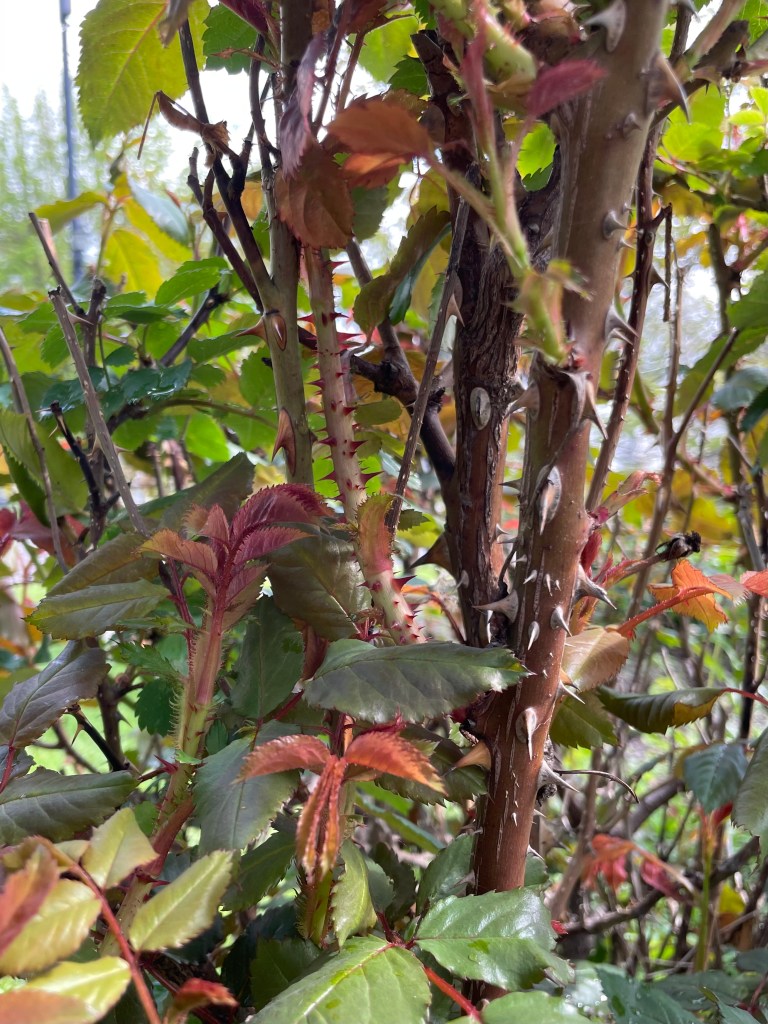
I was out trimming rose bushes this morning and came across a sight that absolutely froze me in my tracks.
The color palette was stunning. I’m not talking about the petals—there aren’t any flowers yet—it was the stems, the leaves, the colors, the textures, the shades, the lines the way they contrasted and complement. I love how each element held its own without any one aspect overpowering.
I love plants, but don’t generally go gaga over foliage. Still, there was something very special about this scene.
First, I should clarify. You may be wondering why I’ve never seen my rose’s leaves before, why I’m swooning over them like a teenage crush. This isn’t my plant. I offered to prune a neighborhood memorial garden, and stopped dead in my tracks when I saw this one particular bush. The others were exactly what I expected, but not this one.
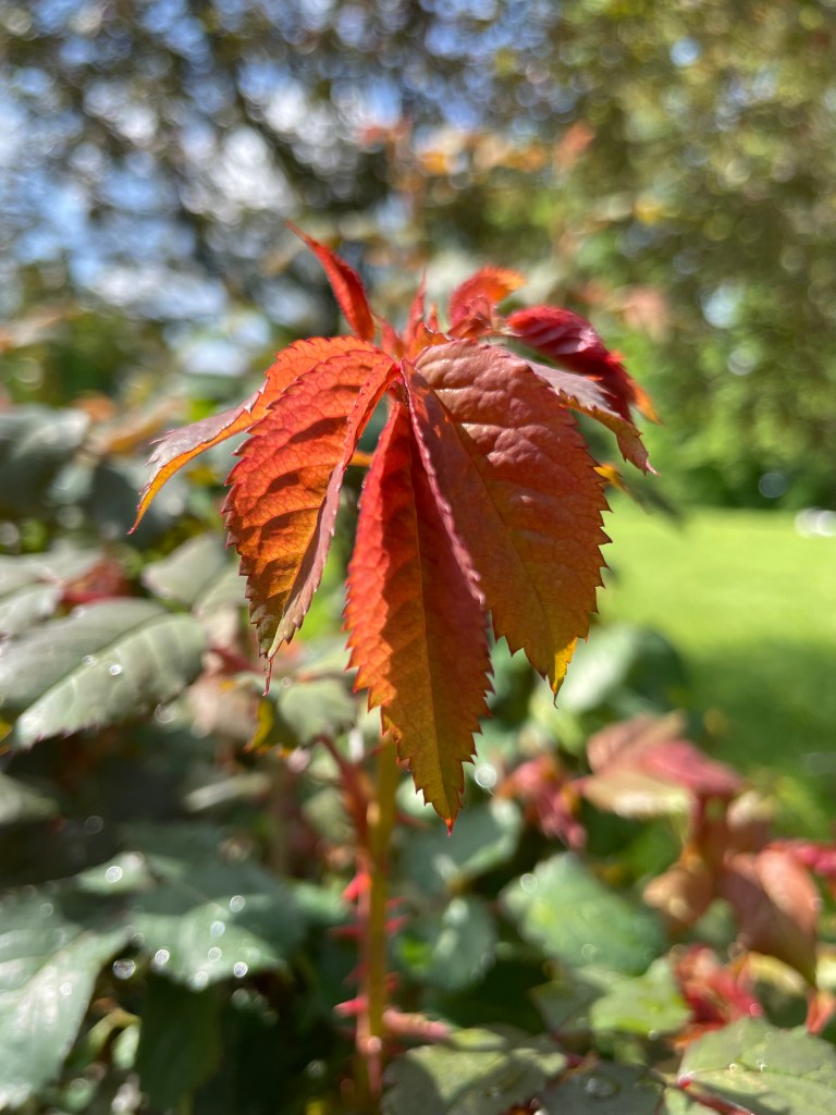
It probably had something to do with the time of day, the blue of the sky, the beads of water decorating the fresh spring leaves. All I had was my phone, but I grabbed some photos. They don’t quite capture the moment, or the shade of orange, but the green, orange, and brown were so lovely together. They looked like a perfectly practiced tango between colors.

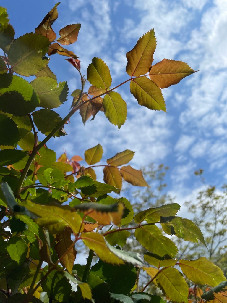
I’m going to keep these colors in mind when I make bouquets this year. Not specifically for the palette, although I dearly love a rusty orange, it’s the feeling I want to remember. I want to aim for that wow factor, a group of flowers that meld and blend together in a very natural yet striking way—that is my ultimate goal when I arrange this year. When I hand someone a bouquet, I want them to feel what I felt this morning when I saw this lovely rose bush.
I’m so glad I had my phone in hand. I almost walked out without, but had a feeling that would be a mistake… Sometimes you gotta trust your gut.
Where do you get your color inspirations?

Leave a comment